SbB Directorate
My ode to science fiction bureaucracy.
Read More
My ode to science fiction bureaucracy.
Read MoreSharp-edged, modular unicase typeface designed on Fontstruct
Read MoreI love concepts cars and modular type, so Honda’s Urban EV is right up my alley.
Read MoreMy odd entry for the Fontstruct Reverse Competition.
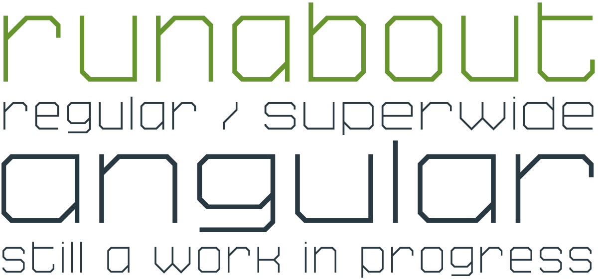
Read MoreMy new experimental unicase typeface, SbB Runabout Superwide, was named a Fontstruct Top Pick. I'm really excited about how it's turned out. Or to be more accurate, is turning out... It's still very much a work in progress. My intent is to use Runabout as the foundation of a whole series of fonts — with a range of widths, weights and designs.

I started working on some sketches for a new typeface design and moved over to Fontstruct to prototype. I really like the way the prototype turned out, even if it looks virtually nothing like my sketches.
I’ve released two designs over on Fontstruct: SbB Runabout and SbB Runabout Superwide. They are free to download with a Fonstruct account.*
A couple of notes about Runabout:
* You can see and download all my published Fontstruct designs on the Sketchbook B Fontstruction page.
I just completely overhauled the fonts* section of Sketchbook B. You can now see everything I've released over the last 7 years** in one place. I've created bigger previews and a more interesting layout.
A few notes:
The fine print: * I really prefer the term "typeface" over "font," but I fear that is a losing battle. And a much longer blog post. ** Well, everything that I've released with the exception of a couple of designs I took off the site until I can update them...
Last week, Stefan Sagmeister unleashed the most high-profile modular typeface design since Wim Crouwel's New Alphabet.

The redesign for the Jewish Museum in New York features two modular typefaces. You can get all the details over at Brand New. It's a complicated and massive identity. I like what Sagmeister has done and the whole system works well. But those modular type designs stood out to me — especially the primary "script" type.
As a fan of modular type and the work of Crouwel in the 60's and 70's, it's really nice to see a high-profile, modern designer embrace a modular aesthetic.
(If you want to play around with modular type, head over to Fontstruct and build something awesome.)
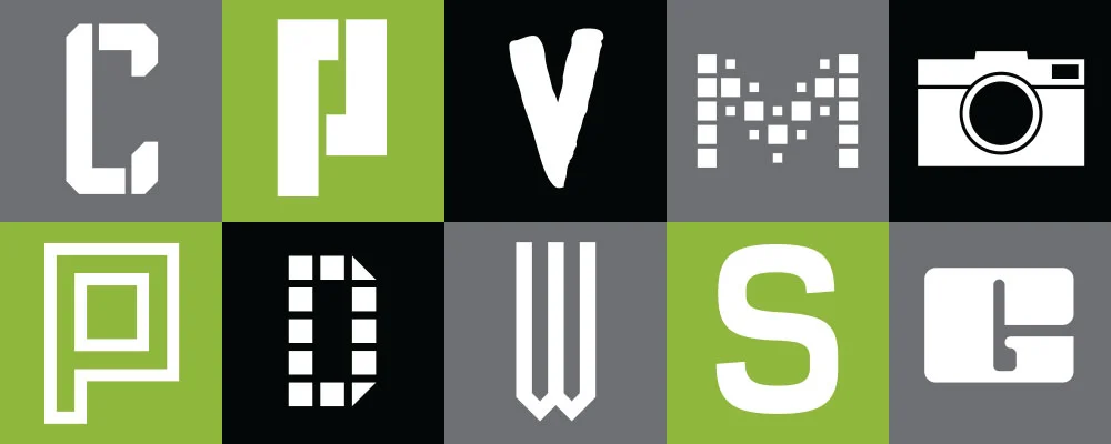
I designed the original Periodic as a pixel font on Fontstruct. As I played with the design, the more I fell in love with it. I like the idea of using the exposed pixel as a design element. Over the past few months, I’ve been tweaking it so that it would work better in print. And I’m using Periodic on my new business cards.
For the final version, I’ve connected the corners and broken the strict pixel grid for some of the special characters. The entire design is monospaced with old style numerals. I’ve also added an oblique version. It’s very readable at small sizes and distinct at display sizes. Get SbB Periodic from the “Download Fonts” section.

I’ve been wanting to get Sketchbook B business cards for a while. And I wanted to use my own fonts for the identity system. I’ve played around with several different looks, but never pulled the trigger and ordered them. Finally, my new cards are printed and they use two typefaces that started life on Fontstruct: SbB Dradis Alpha and Periodic.

I just released the SbB Dradis family. It’s an odd experimental display typeface that can be used without spaces in between the letters. I’ve updated the masthead on the site with a new Sketchbook B logo in Dradis.
Periodic is a monospaced, pixel font with old style numerals that I designed to be used in print. For most designs, visible pixels are a no-no, but I think they add some texture and interest. I’m using a version of Periodic that I’m still tweaking. It’s a refined version of the one I quietly released on FontStruct. Once I finish polishing Periodic, I’ll release it here.
I love my iPad. And I really don't care about the fact that iOS doesn't support Flash. With one exception... I'd like to run FontStruct on my iPad.
The other day, I found iSwifter for the iPad. It's essentially an alternate browser that allows you to open websites with Flash. It's "free" to try, but if you want to use it for more than a few minutes you have to pay $0.99.
And using it, I was able to open FontStruct on my iPad and create a typeface. It's slow - really slow - but it works. The real problem is that FontStruct isn't designed for a touch interface. The controls are too small. And it's very hard to be precise. After creating a few characters, I gave up. For FontStruct to work well on iOS - or any tablet - it's going to need an interface redesign. It's more than simply supporting Flash.
So I'm still waiting for FontStruct on my iPad (and I'm very willing to pay for an iOS app.)
Last year, after South Carolina beat Clemson, I built a quick font based on South Carolina’s Block C logo. I called it Scoreboard and included a glyph that had the SC-Clemson score for the 2009 game. Well, after South Carolina once again beat Clemson on Saturday, I decided to update the font with this year’s score. (I previously had added the USC baseball team’s national championship score this summer, but never posted about it.) Anyway, download Scoreboard for free at Fontstruct…

I needed a pixel font for a project I was working on so I built one in Fontstruct. Periodic is a monospaced design with upper and lower case, a wide range of characters and punctuation and old style numerals. For best results in Photoshop, turn off antialiasing and set the type size to 16 pixels. If you need a pixel-based design, download Periodic for free at Fontstruct.
