Introducing Intermodal
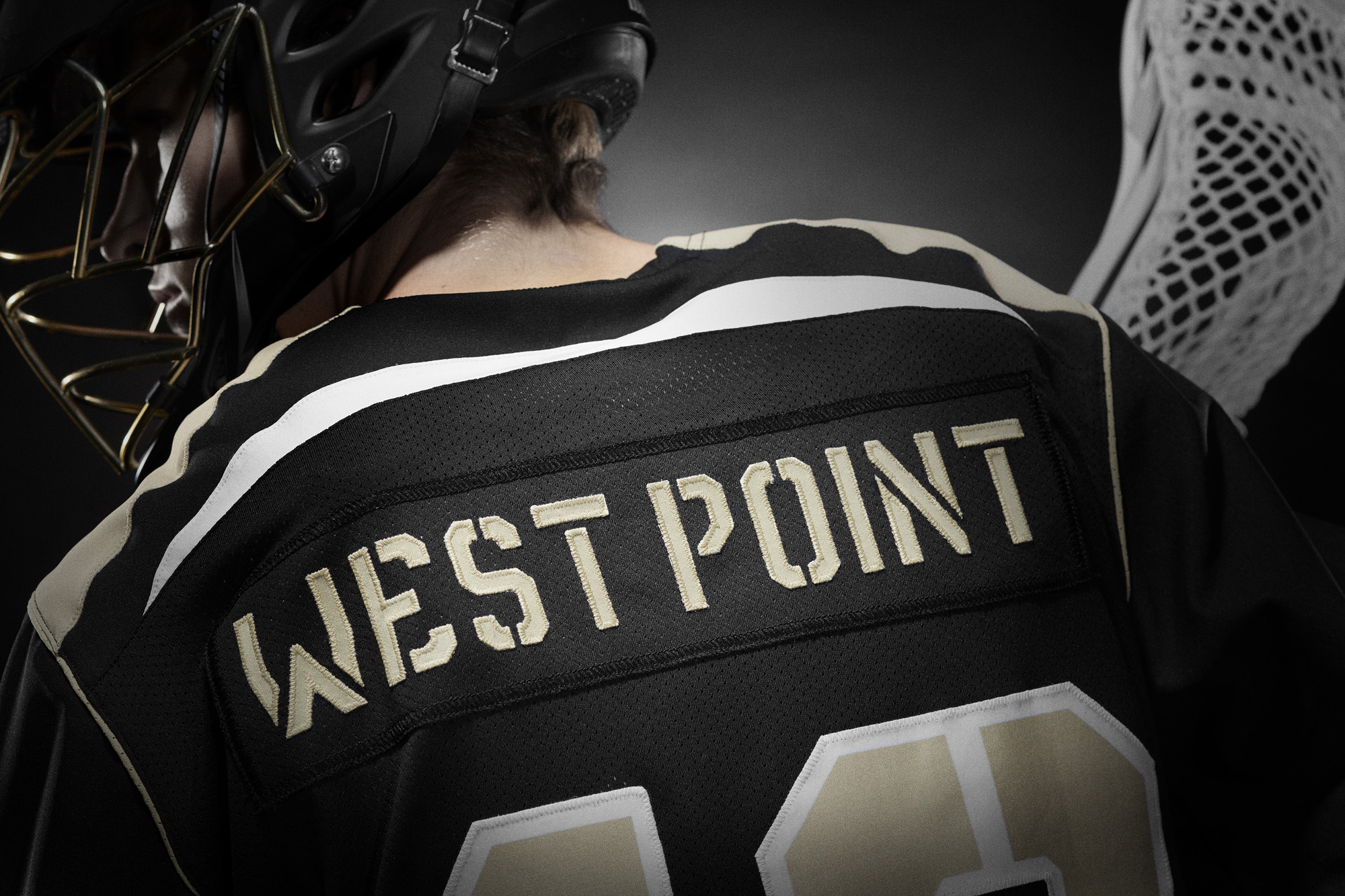
I’ve been fascinated by stenciled type for a while. Stencils started as a practical necessity – an easy and utilitarian way to reproduce type. But the use of stencils has evolved and is now visually representative of industry and military.
A few weeks ago, I quietly rolled out my latest stencil typeface on Creative Market: Intermodal.

Intermodal started as an experiment. I wanted to create a design that had only vertical stencil cuts. I didn’t like how the cuts on other stencil designs didn’t line up cleanly. By only using vertical cuts, I didn’t have to worry about the horizontal alignment.*

Intermodal is an all cap design, but includes a wide range of foreign language characters, a set of Opentype tabular numerals and an alternate “9.” Intermodal doesn’t have traditional weights. Instead, there are five widths, from A to E. A is more narrow and E is wider. The different versions can be used together to create a utilitarian look. I’ve also got an oblique version of each width for a total of 10 fonts in the family.

For now, the entire Intermodal family — 10 fonts in all — is available exclusively at Creative Market for $29.
Intermodal is one of my favorite creations. I hope you like it.
* After my first set of sketches, I noticed that it was structurally very similar to Power Grid. So I added a stencil version to Power Grid 2.0 and I continued to refine Intermodal. Different look, but similar design approach.