
Rebranding with stencils →
I've been playing around with stencil designs a lot lately and I recently came across this rebrand of Army West Point athletics by Nike. I love how they've used the stencil throughout everything. Check out the rebranding microsite to see the entire identity.
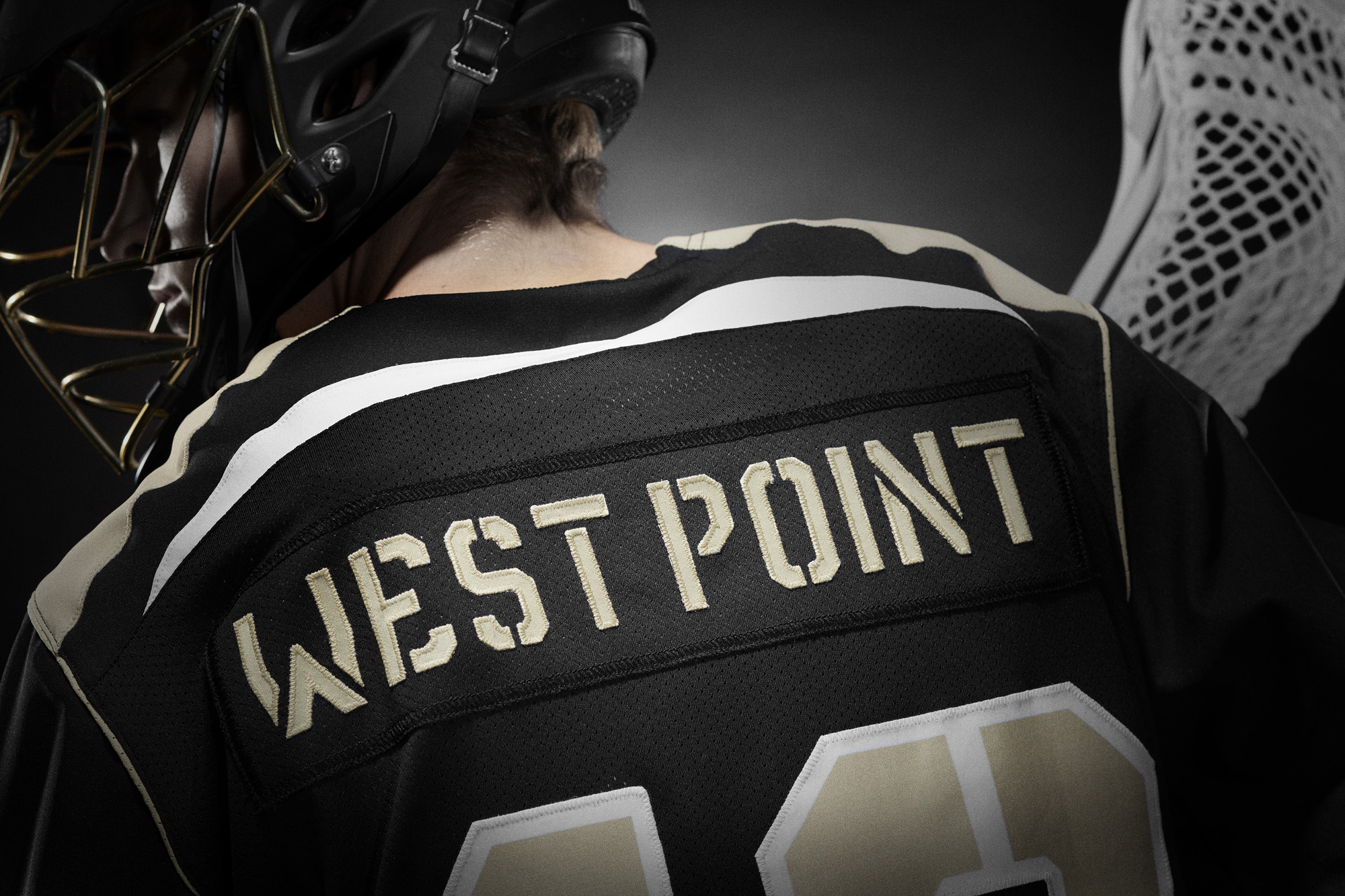
"Stenciled" on the back of a lacrosse jersey.
Also, while I'm not a big fan of overly constructed design rationales, this explanation for why Nike chose a stencil was perfect:
During World War II, the U.S. Army deployed approximately three million trucks, tanks and other vehicles, each of which was marked. Items were tagged using stencils because they were fast, easy to use and produced clean markings. The distinctive look of stencil type is created from the gaps between horizontal and vertical portions of the letters designed to serve a routine function durability.
This typographic style is authentic to military culture and the use of stencil letterforms by the U.S. Army dates back to the Civil War. New and innovative stencil fonts have been common throughout the twentieth century and never fall out of style. Strong primary typography is a critical component of the Army West Point Athletics identity.