Luke’s for a day

Impressive guerrilla marketing campaign turns local coffee shops into everyone’s favorite Stars Hollow diner

Last week, coffee shops all over the nation rebranded themselves for a day as “Luke’s” — the fictional diner from the TV show Gilmore Girls. This bit of marketing genius was part of a promotional effort to promote the new Gilmore Girls Netflix miniseries.

In South Carolina, only one coffee shop was selected to be Luke’s: The Wired Goat in the Vista. As a Gilmore Girls fan, I was looking forward to stopping by and getting my cup with a Luke’s coffee cup sleeve. (I'm also a Wired Goat fan... that's where AIGA South Carolina holds it's monthly coffee meet ups.)

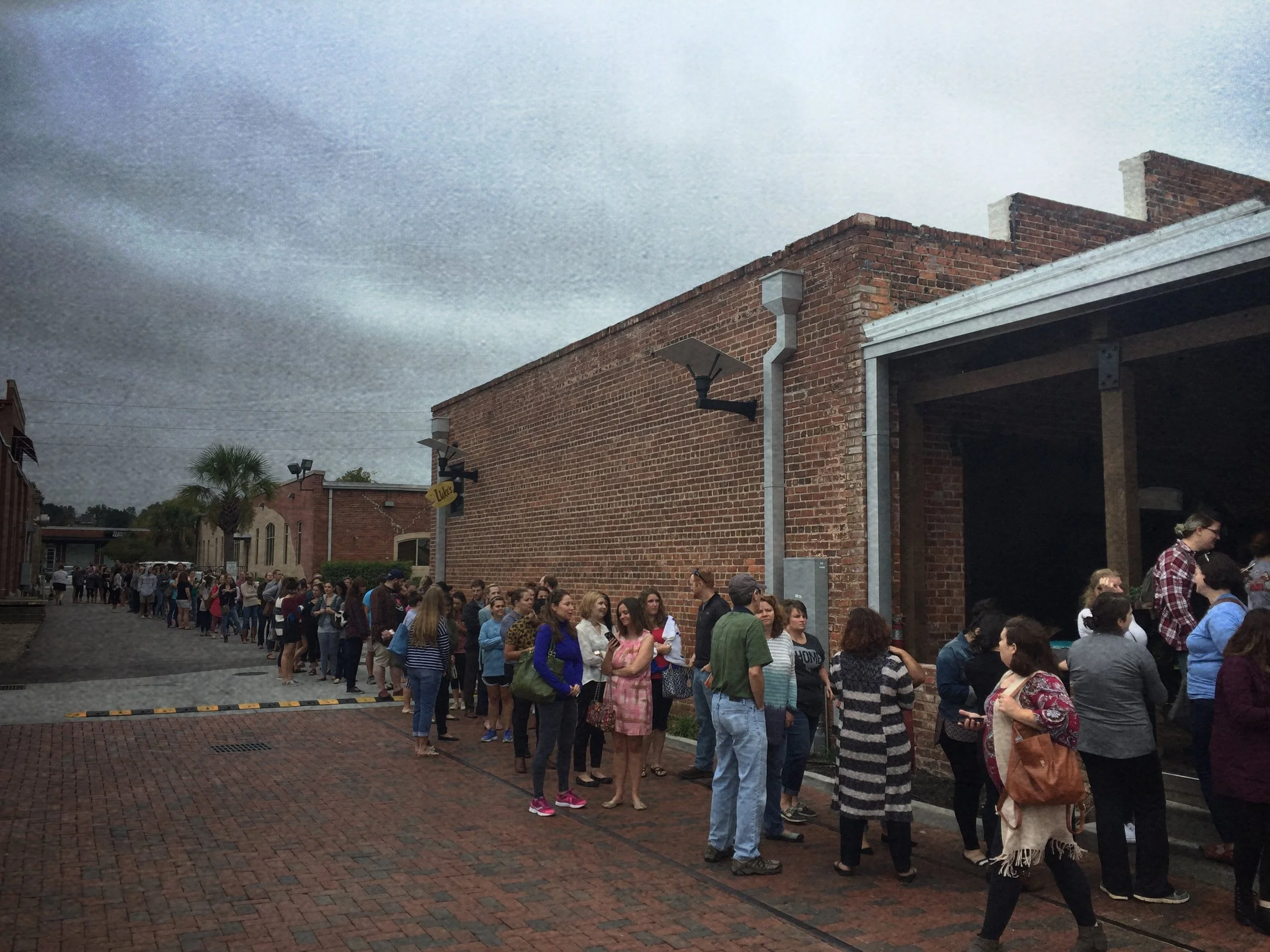
The line stayed this long pretty much all day.

The line stayed this long pretty much all day.

I expected it to be crowded, but when I got to the Wired Goat, I was floored. The line extended out the door and down the alley. I drove by a couple of times that day, thinking that eventually the line would get shorter. It didn't. Fans kept coming until there was no more coffee to be sold. Gilmore Girls fans gathered from all around to celebrate one of their favorite shows. (I even heard stories of fans driving from adjacent states to be part of the Luke’s experience.)

Kudos to the ad agency or marketing firm that dreamed up this campaign. It really is a perfect guerrilla marketing scheme, with every participant getting something out of it. Netflix gets the exposure they want with a relatively minor investment. The selected coffee shops get positive exposure and additional traffic for the day. And the fans get a place to celebrate with other fans and then share their experience online. 

I never made it into the Wired Goat that day. I’m a Gilmore Girls fan, but I just couldn’t spend an hour in line. A few days later, though, my wife and I made in to the Wired Goat and they still had the Luke’s coffee sleeve. 

And, of course, we took pictures and shared them.

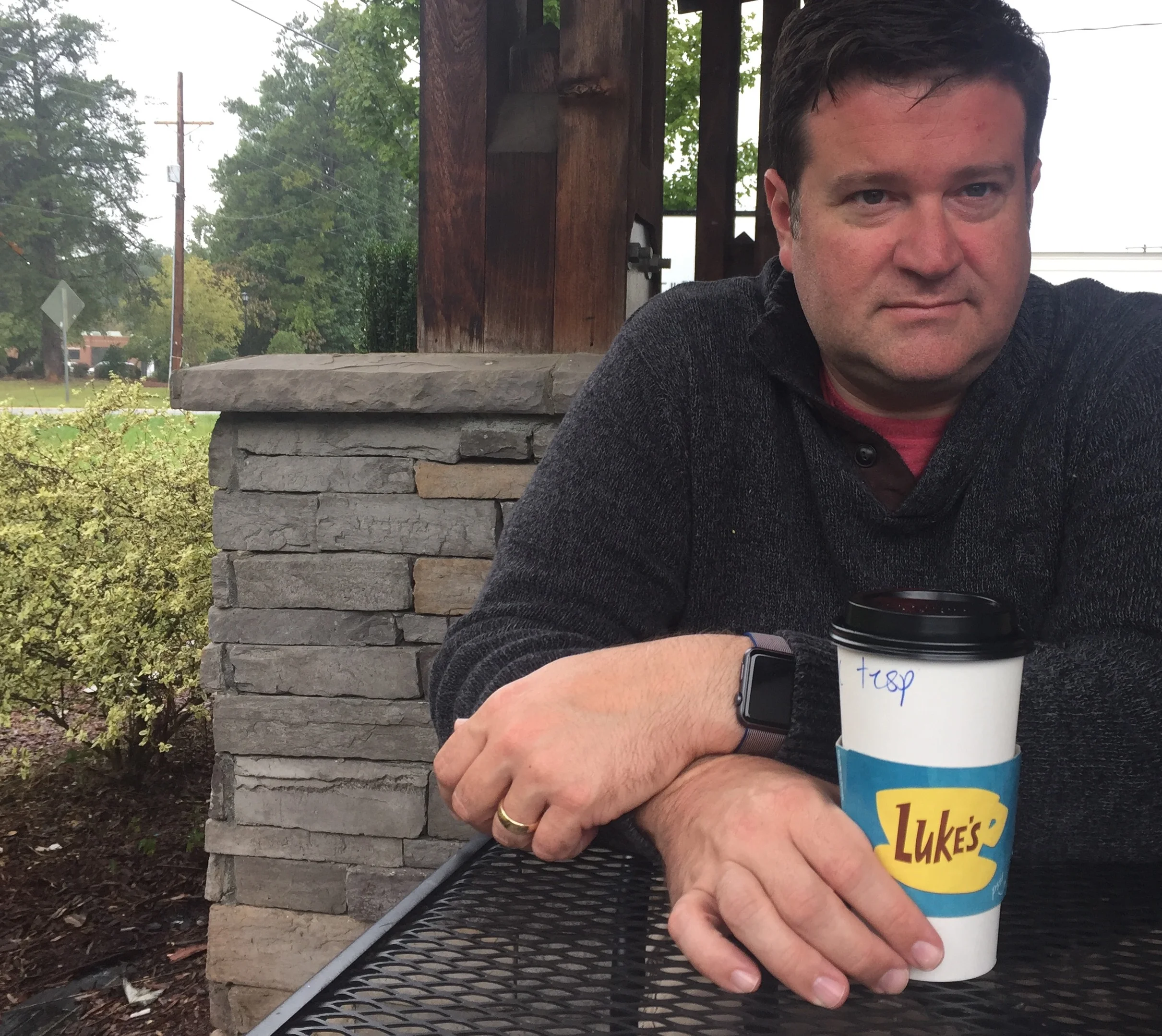
My serious coffee face, with A Luke's cup.

My serious coffee face, with A Luke's cup.


Bob Wertz writes about design, technology and pop culture at Sketchbook B. Bob is a Columbia, South Carolina-based designer, creative director, college instructor, husband and dad. He’s particularly obsessed with typography, the creative process and the tools we use to create. In his spare time, he loves to binge watch 1990's television series. Follow Bob on Twitter and Instagram.

A "New!" Page

Creating a new home page for Sketchbook B

I’ve had Sketchbook B since 2008. And for the entire life of the site, it’s been pretty much the same structure — the home* page is the main blog page. During the summer, I started experimenting with a new page design that could replace the home page. I wanted to figure out a way to quickly highlight everything that is on Sketchbook B, not just the blog.

The site has been hosted on Squarespace for the last 8 years and has migrated from version 4 through version 7. As a result, I’ve never completely taken advantage of some of the newer, more powerful options that are available.

Squarespace lets you easily pull in and format content from other pages on your site. So I was able to create a page with summary blocks for blog posts, recurring series, my typeface designs and social content like Instagram. 

It took me a little while to figure out exactly what I wanted and make sure the new page rendered the way I wanted it to on mobile. Squarespace does a great job of building a responsive site, but some of the individual summary blocks didn’t always behave in mobile or tablet views the way I expected.

As a result of the tinkering, I started playing with custom CSS in Squarespace. I had forgotten how customizable everything is and I can’t wait to experiment with it some more.

A “New!” page is now in the navigation.** I'm going to continue to work on it, but I like it enough to make it the first thing a visitor sees when they type in sketchbookb.com. The blog page remains at the same address: sketchbookb.com/journal. If you prefer the other view, just bookmark it and it will be like nothing has changed.


* I hate the term home page. It seems so old to me. When I first started playing on the internet in the late 90s, “webmasters” built and maintained “homepages.” But alas, I don’t have a better term. Maybe landing page?

** Yes, the "New!" includes an exclamation point. I don't normally use exclamation points, but I liked it here...


Bob Wertz writes about design, technology and pop culture at Sketchbook B. Bob is a Columbia, South Carolina-based designer, creative director, college instructor, husband and dad. He’s particularly obsessed with typography, the creative process and the tools we use to create. In his spare time, he tinkers with the site design of Sketchbook B. Follow Bob on Twitter and Instagram.

Ads and blogs

After 8 years, I figured I’d give it a shot.

I never really felt compelled to put ads on Sketchbook B, but this week, I added a couple of ads to my site — one in the sidebar and one that should show up at the bottom of the page on mobile. Some thoughts:

  • I’m using Google Adsense. I looked at various options, but Adsense provided the best option for my site. Most other options weren’t available for a site without massive traffic numbers.
  • Keep it simple. I always admired the simplicity of ad networks like The Deck. (If you aren’t familiar with The Deck, check it out on sites like Daring Fireball.) So I added a single ad in the sidebar of my site. I also added a single mobile ad that will show up at the bottom of a mobile device. The designer in me doesn’t want to cover my site in ads.
  • Pocket change. Here’s the thing about “monetizing” your blog… it’s not a lot of money. I think that’s why I’ve resisted it for so long. I just wasn’t sure it was worth it. But over a year, it may add up. We’ll see. Any money that I make will just help pay for hosting through Squarespace.
  • Putting the ads on a Squarespace site is easy. Once you are approved through AdSense, you get a block of code to add to your site. Squarespace has a code content block that you can add pretty much anywhere. You can also use the page level or site level code injection feature to insert ads for mobile.
  • Be patient. Once you place your first ad, your site has blank ads until they confirm the ad unit has been placed correctly. All of this makes sense, but it feels odd to have a big empty space on your site for a few days. You begin to wonder if you messed something up. After all, adding the code block was easy. Maybe too easy. And then the ads start running…
  • Optimization. Google offers a bunch of hooks into Google Analytics to maximize conversion rates. It's going to take me a little while to figure it all out.
  • Other sites. I've started here on Sketchbook B, but I'll probably add them to In Store Columbia as well.

I don't intend to cover my site in ads, though, like so many blogs out there. I'm going to give it a few months before I decide whether or not to keep the ads. It's an experiment and I'll continue to post about the experience here.


Bob Wertz writes about design, technology and pop culture at Sketchbook B. Bob is a Columbia, South Carolina-based designer, creative director, college instructor, husband and dad. He’s particularly obsessed with typography, the creative process and the tools we use to create. In his spare time, he moves things around on his blog. Follow Bob on Twitter and Instagram. 

What I want in a newspaper

How do we make the printed newspaper relevant again?

As a kid, I loved the newspaper. Growing up in suburban Chicago, we had the Chicago Tribune and the Aurora Beacon News delivered to my house daily. And there was a local weekly called the Windmill News. I was a paper boy for the Aurora Beacon News and one of my original majors in college was journalism. Newspapers were a major part of my life growing up.

I'm still a news junkie, but it’s been years since I subscribed to the newspaper. As much as I love the daily newspaper, that’s not how I get the news anymore. I don’t have time to sit and read it every morning and all the breaking news I want is delivered through Twitter or the web.

I’ve been thinking lately about what I want from a modern local paper. What would make me subscribe again? In my perfect scenario, this is what I would love to see:

Fiercely local. 

I get my breaking national news from the internet. My newspaper will give me news I don’t get from Twitter. Newspapers now are half filled with wire stories and in today’s world, that doesn’t make sense. I get that news online the instant it breaks — not the next morning.

I want a newspaper filled with local stories and local perspective on national stories. 

National newspaper conglomerates are mostly interested in efficiency and streamlining operations. The emphasis on local would mean investing in local reporting and probably impact their balance sheets. And so for my modern newspaper to be fiercely local, I assume that it also needs to be fiercely locally-owned.

Once a week.  

My local paper — The State — often sets up a booth in the local grocery store trying to sell subscriptions. Their sales pitch is that you can get the entire week of papers for the same price as just the Sunday paper. People perceive value in the Sunday paper. 

I never have time to sit and read the paper. But for me, Sunday is the best option for spending a significant amount of time reading and I think that most papers will be better off with just one paper a week, delivered to your doorstep.

There are all sorts of problems with the economics of producing and delivering the paper just once a week. What are the presses doing the rest of the week? How do you hire a delivery team that only works one day a week? Sunday delivery keeps the lucrative retail insert profit alive, but will your subscriber base be large enough to entice advertisers to continue to print and place inserts.

So my modern newspaper — assuming you can work out the financial model — would be delivered to your doorstep once a week on Sunday.

Smart mix of online and print

Just because you only print a paper once a week doesn't mean you do nothing the rest of the week. My perfect paper would have a smart mix of online content to supplement the printed version. Blogs, podcasts and exclusive online content would keep you connected to the writers and editors. Relevant social media engages readers. Your reporters become trusted sources and well-known voices. With today's consumer, I think the success of a modern newspaper depends on this deep connection with the readership.

The Perfect Size. 

I miss the old broadsheet papers, but the logistics of printing a newspaper in smaller quantities and reduced runs means that the size of the newspaper needs to be a strictly business decision. I guess a tabloid size is the most logical, but I'm open to whatever size makes sense.

Comics

On Sundays after church, I used to sit with my dad and read the comics. I looked forward to that every week. How can we bring back that magic? The daily grind of comics burned out countless cartoonists. Would we still have Calvin and Hobbes if the schedule wasn't as relentless? A modern newspaper should work with cartoonists to recapture the magic. Partner with them to develop new models and formats.

Respectful online experience

Ads are part of the financial model that makes content possible.  I understand that, but for online ads, be respectful. Today's ads are obnoxious. Terrible. They slide in and pop up and create an awful experience. I am not opposed to advertising at all, but a modern newspaper needs to respect its readers and provide a first rate experience.

Well designed and high quality

Newspapers typically aren't held up as examples of great design. The breakneck daily schedule doesn't leave much time for refinement and reimagining. A modern newspaper has to take a step toward better design quality. Most newspaper websites aren't much better than their printed counterparts. Make content easy to find and search.

Modern consumers value design quality and high quality photography. A modern newspaper must meet those expectations.

Can this happen?

I'm not sure if anyone could pull this off. Current newspaper conglomerates have shown they don't have the foresight to pull off a massive shift like this. An entrepreneur would have to find funding, but good luck finding an investor that thinks starting a newspaper in 2016 is a good idea. 

But I still think there is value in a printed news vehicle, and not just because of the ads that are in the Sunday paper. I hope someone figures out a model before all of the local papers are gone.

Using my Apple Watch

I’ve seen a bunch of articles lately discussing the Apple Watch. Some folks feel the Apple Watch is a complete failure. Others argue that it’s a flawed success. But I’m going to take a slightly different take… Instead of telling you what doesn’t work, I’m going to tell you how I use my Apple Watch* every day.

Time. I know it's simple, but the Apple Watch does a great job of telling time. I forgot how much I missed wearing a watch. And I like that I can use different faces when I feel like it.

Schedule. I’m a long time Fantastical user on iPhone and I use the Fantastical complication to keep an eye on my upcoming meetings and schedule. I prefer the Fantastical watch app to the stock Apple Watch calendar app.

Weather. Apple Watch is perfect for getting a quick forecast. I've used Dark Sky on my iPhone for years and I like the Dark Sky watch complication better than the Apple weather app.

Activity Tracker. I used to wear a Fitbit, but I had syncing issues all the time. The Apple Watch tracks my steps and activity. I wish there was a better interface for viewing the data, but it syncs everything perfectly.

What’s the score of the Cubs game? I love that I can ask my watch for the score of the Cubs game. Siri quickly displays the score. Really helpful because the Cubs are awesome this year...

Apple Pay. As I’ve mentioned before, I love Apple Pay. And Apple Pay on the watch is even more effortless.

Timers and alarms. Apple Watch makes it easy to set timers for cooking and alarms for upcoming appointments.

Find my iPhone. Apple Watch lets me ping my phone and find it quickly. Helpful when I’m not sure exactly where I put it down around the house.

Remote. We love our new Apple TV. But occasionally, we can’t find the remote because it is ridiculously tiny and gets lodged between couch cushions. The Apple Watch is actually a great emergency remote for the Apple TV.

Quick response text message. I actually use the canned responses for text messages on my watch. Sometimes, all you need to answer with is “OK,” “Yes” or “No.” Or just an emoji. Apple Watch is great at that.

VIP. My notifications are mostly turned off for emails, but not from the VIPs that I’ve identified in Mail app on my phone. I get a quick buzz when someone important emails me. (I get too much email to get a notification every time anyone emails me.)

Directions. If you use Apple Maps, Apple’s implementation of directions on the watch is really nice. When I get driving directions, the next exit number or turn is on my wrist. And it buzzes when I need to make a turn. 

Sending stupid sketches to my wife. Liz also has an Apple Watch. Sometimes, sending a silly sketch is more fun than sending a text message.

Switching watch bands. It’s so easy to change out the watch band. I’ve got two and like to flip between them. I’m probably going to buy one or two more.

So is the Apple Watch worth the investment?

I feel like Apple Watch is worth the investment. Your mileage may vary. I really enjoy wearing the watch and get more than enough use out of it to justify the $300 I paid.** But people use the watch in different ways and you may come to a different conclusion.

The Apple Watch is an accessory.*** It’s not a full fledged computing platform. The screen is tiny. The interface isn’t as intuitive as it probably should be. There are plenty of first generation rough edges to iron out. 

But I find the Apple Watch fun and useful and I enjoy wearing it. For me, that’s enough.


* Apple Watch Sport, Space Gray, 42 mm.
** On sale at Best Buy.
*** I would argue that all smart watches on the market today are just accessories.

Patiently waiting for Apple Pay

About 20 years ago, fast food establishments were a cash only deal. I remember when the first restaurants started taking credit and debit cards. It was a mess. They wouldn't have a pen for you to sign the receipt. The cashiers were confused. I hated carrying cash, though, and would go out of my way to find a restaurant that took cards. Sometimes, it didn't work. It took a while, but over time, the experience got better and now, almost everyone accepts debit cards. Cash only establishments are the exception, not the rule.

I feel like we are seeing a similar slow transition with Apple Pay and contactless payment in general. 

When Apple Pay works, it's magic. Effortless. Yes, sometimes cashiers are confused and occasionally, the system doesn't work correctly. But I still go out of my way to visit a store that accepts Apple Pay because the experience is that good.

I go to the Walgreens near my house more often now because they take Apple Pay. And I was excited tonight to find out the neighborhood Starbucks takes Apple Pay now, too.

My desire to use Apple Pay is only amplified by the messy chip card rollout. While I understand why we've made the switch to chip cards, I hate everything about the process.

It might be a little messy for a few more years. But hopefully, in 20 years, contactless payment will be everywhere and we'll remember how absurd debit cards were.

Until then, I’ll be waiting patiently.

Quick thoughts on "texting in public" with Talkshow

I’ve really had fun this week with Talkshow, a new messaging service/social media network. Essentially, it’s texting, but in public. It's a mix of Twitter and texting. You are able to converse with friends and other people can see the feed, like posts and react to posts. It’s pretty intuitive and I enjoyed playing with it.*

It's iOS only. So iPhone or iPad is your only option. Talkshow isn't available for Android and you can't post from a computer. You can share your conversations with others through a web view and embed "shows" on pages.

To give you an idea of what it's like, embedded below is a sample of a conversation between my friend and former coworker James Leslie Miller.** Our conversation eventually wanders into a discussion of design software and another user, Greg, requested to join as a cohost. 

If you try out Talkshow, look me up. As always, my handle is @sketchbookb.


* I also experimented with Snapchat this week. I'm so confused.

** He'll always be "Jim" to me.

Linked: The Oregon Trail Generation

My friend Kerry finds the best links. And I love this story he posted on Twitter about the "Oregon Trail Generation." A great article if you, like me, are stuck between Generation X and the Millennials.

Because we had one foot in the traditional ways of yore and one foot in the digital information age, we appreciate both in a way that other generations don’t.  We can quickly turn curmudgeonly in the face of teens who’ve never written a letter, but we’re glued to our smartphones just like they are.

I mentioned a couple of weeks ago that I became a designer just as that industry was changing and I feel like my appreciation for both the old way and the new way makes me a better designer. In the same way, I’m part of a generation that didn't have email in high school, but had it in college. That watched the internet become a thing. A generation that remembers a social life before social media, but now actively uses Twitter, Facebook and Instagram. The world completely changed in the middle of my formative years and it absolutely influences the way I look at the world. 

If you want to find more of Kerry's awesome links, subscribe to his email newsletter and get five (or more) links every Friday.

Linked: How to spell 'Internet'

One of my first majors in college was journalism. And as a journalism major, you become intimately familiar with “AP style.” The Associated Press has published the definitive guidelines for newspaper writing for decades, but it’s influence spreads beyond just news publications. I’ve used AP style at pretty much every company I’ve worked for.

One of the things I hate about AP style is the capitalization of “Internet” and “Web” as proper nouns. But thankfully those days are over and, starting in June, the official AP recommendation is to use internet and web in lower case. I’m very happy about this, and I’m completely aware of how geeky that is.

Five Thirty Eight has a great little article showing that maybe we’ve already started the transition.

Change.

Last week, I talked to an advertising class at the University of South Carolina. One of the things I mentioned was the need to stay up-to-date on the changes in the communications industry. 

In preparing for my talk, I started a list of the things that have changed during my career —  roughly 20 years of being a creative professional.*

The list was really, really long. I've included a couple of links for all the really obscure stuff:

  • Aldus Pagemaker became Adobe Pagemaker. Then was gone.
  • Quark Xpress was everywhere. Adobe InDesign arrived. Then Quark was gone.
  • Individual Adobe applications became the Creative Suite bundle. And then the Creative Cloud suite.
  • Apple was dying. Now Apple is everywhere.
  • PDF.
  • Bitmap fonts. Adobe Postscript Type 1 fonts. TrueType. Open Type.
  • The Internet became a thing.
  • Email became a thing. Followed by HTML Email. And spam.
  • Netscape rises. Internet Explorer kills Netscape. Internet Explorer is awful and dies a slow and painful death.
  • Web 2.0 (Which if we are honest, isn’t really different than Web 1.0.)
  • Standards-based web design. Javascript. CSS.
  • The search engine.
  • Social media. All of it. MySpace. Facebook. Twitter. LinkedIn. Flickr. Instagram. Vine. Google+. Snapchat. Periscope. Meerkat. And lord knows how many more failures I’ve forgotten about.
  • Macromedia Flash. Adobe Flash. Who needs Flash?
  • Streaming video. Real Player. Quicktime. YouTube.
  • Floppy disks. SyQuest 44. SyQuest 88. Zip. Zip 250. Jaz. CD-R. Flash drive. Cloud storage.
  • DVD. Blu-Ray. 
  • Avid. Premiere. Final Cut. Final Cut X. Premiere.
  • Blogging.
  • Powerpoint. Sigh.
  • Digital photography arrives. Eventually becomes affordable. And now we have camera phones.
  • Royalty-free stock photography CDs. Replaced by websites when bandwidth gets fast enough.
  • TV has completely changed. Standard Definition. High Definition. 3-D. Now Ultra HD.
  • The smartphone. Palm and BlackBerry rise. iPhone and Android kill them.
  • Mobile apps.
  • Responsive design.
  • Wacom Tablets.
  • iPads and other tablets.
  • eBooks and Kindles.
  • Black and white screens. Hundreds of colors. Thousands of colors. Millions of colors. Retina displays.
  • Short-run digital printing.
  • Bluelines and photographic platemaking gets replaced with much more efficient computerized versions. (But I still I miss the smell of bluelines.)
  • The eternal promise of variable data printing.

All of this change and disruption occurred in such a short period of time. And this is just in one industry. My interest in design started when I was in college in the mid-1990s at the beginning of all this change. The designers and communicators that are thriving today are the ones that are able to change and adapt constantly.

Looking ahead at the next 20 years, the only thing I’m 100% sure of is that the world isn’t going to get less complex. For designers and communicators, the ability to evolve and adapt is going to be more critical to success than ever.


* I seriously feel old.

Write everywhere: Ulysses comes to the iPhone

My go-to writing app on my Mac and my iPad is Ulysses. I love the simple structure and that I can pretty much write anything... from a blog post to something much longer. And my writing syncs between my devices.

Now, my writing syncs between all my devices. Ulysses for iPhone launched today. The app is impressive and includes some great implementations of iOS features — iCloud synced all my content effortlessly, Handoff works great between devices and the share extension works perfectly.

I don't plan on writing long essays on my phone, but I think I'll use Ulysses on the iPhone frequently:

Brainstorming. When an idea strikes, I can add a note directly to the writing app. Since I always have my iPhone with me, I'll be able to capture those random thoughts and convert them into actual posts or essays more easily.

Links. I can use the share extension to send links I find directly to Ulysses. For links I want to write a post about, this will be much more convenient than using a service like Evernote.

Edit on the road. The keyboard on my iPhone isn't great for writing longer pieces, but Ulysses should be perfect for reading and editing on the go.

Ulysses isn't for everyone. It's a Markdown editor, so you need to be comfortable writing in Markdown. And it's not cheap. Ulysses for Mac is $45 and the mobile version is $25. In this era of free and freemium apps, this is an expensive app, but Ulysses is a professional tool and worth every penny.

I was expecting to have to pay for the iPhone version, but because I had already purchased Ulysses for iPad, I got the new Ulysses Mobile with support for iPad and iPhone as a free upgrade.

If you are looking for a Mac writing ecosystem and like working in Writedown, Ulysses might be the perfect system for you. There’s a great review over at MacStories if you want lots of specific details.