Rethinking "On Typekit"

Sometimes, you've just got to drop back and punt*

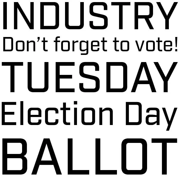
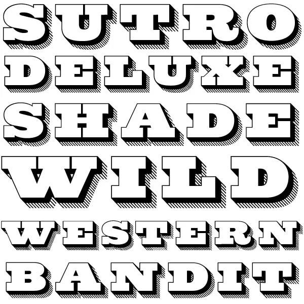
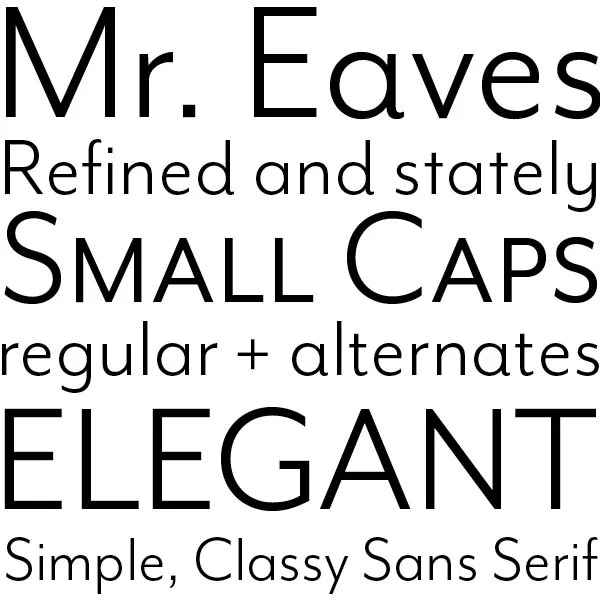
So after five weekly posts, I'm going to rethink the "On Typekit" series I started to highlight some of the awesome type available on Typekit included for free with your Creative Cloud subscription. There are a couple of reasons:

  • It was confusing that I was highlighting other people's type on my blog where I promote my own typefaces. In retrospect, another, completely separate site would have been a better fit.
  • Typekit recently introduced Typekit Marketplace where you can buy typefaces that aren't available as a subscription. I was using "On Typekit" to mean "Free on Typekit." That's not necessarily going to be the case for everything on Typekit going forward.
  • Honestly, it wasn't as fun as writing other posts like Forgotten Slides or Designer Toolkit. I introduced three weekly series in a one month period and I figured out quickly which ones I enjoyed and which one I did not.

So I'm taking a time out. I may reintroduce it later, but it would be over on Medium or Tumblr. I still like the idea of helping people discover typefaces on subscription services, but "On Typekit" wasn't the right approach.


* One of my father's favorite sayings...


Bob Wertz writes about design, technology and pop culture at Sketchbook B. Bob is a Columbia, South Carolina-based designer, creative director, college instructor, husband and dad. He’s particularly obsessed with typography, the creative process and the tools we use to create. In his spare time, he has ideas that don't always work out. Follow Bob on Twitter and Instagram.

Industry

Appropriately corporate.

Every Tuesday, I highlight a typeface from Typekit that's included for free with your Adobe Creative Cloud subscription. 


Industry is a 16 font family from Fort Foundry with a wide range of weights from thin to ultra. The proportions are great and the letterforms are geometric and angular. Industry would be great as a header or some accent text in a sidebar.

I wasn’t familiar with Fort Foundry before I found Industry in Typekit, but Fort Foundry (aka Mattox Shuler) has a range of really interesting typefaces that are right up my alley. I look forward to installing a few more.

(Not sure how to add fonts from Typekit to your computer? Check out this Adobe Help document on how to install Typekit desktop fonts.)


Bob Wertz writes about design, technology and pop culture at Sketchbook B. Bob is a Columbia, South Carolina-based designer, creative director, college instructor, husband and dad. He’s particularly obsessed with typography, the creative process and the tools we use to create. In his spare time, he ignores robocalls from political organizations. Follow Bob on Twitter and Instagram.

Sutro Deluxe

An added dimension

Every Tuesday, I highlight a typeface from Typekit that's included for free with your Adobe Creative Cloud subscription. 


I love Jim Parkinson's work. I first became aware of his work with newspaper and magazine logos, but his typeface designs are amazing, too. 

Sutro is a slab serif that resembles a Clarendon. It's an amazingly diverse typeface family, with a wide range of weights. But Sutro is unique in providing a distinct display face, Sutro Deluxe. Parkinson calls Sutro a "Chromatic" design, meaning that you can combine multiple fonts to get a colored effect. The entire Sutro family is on Typekit. I can't wait to find a project to use it on.

(Not sure how to add fonts from Typekit to your computer? Check out this Adobe Help document on how to install Typekit desktop fonts.)


Bob Wertz writes about design, technology and pop culture at Sketchbook B. Bob is a Columbia, South Carolina-based designer, creative director, college instructor, husband and dad. He’s particularly obsessed with typography, the creative process and the tools we use to create. In his spare time, he troubleshoots Creative Cloud. Follow Bob on Twitter and Instagram.

Hobeaux Rococeaux

On Typekit: An 18th century twist on Hobo?

Every Tuesday, I highlight a typeface from Typekit that's included for free with your Adobe Creative Cloud subscription. 


James Edmundson designed a modern version of Morris Fuller Benton’s much maligned Hobo. The new version, Hobeaux comes in a variety of weights and a modern character set. But alas, that’s not the Hobeaux I’m talking about today.

That’s right, there is another. Hobeaux Rococeaux. An bizarrely ornate, flourished version of Hobo — hence the style name Rococeaux. I’ll be honest, I have no idea where I would ever use Hoboeaux Rococoeaux, but the fact that it exists and is available as part of your Creative Cloud subscription… it makes me want to find a reason to use it somewhere.

(Not sure how to add fonts from Typekit to your computer? Check out this Adobe Help document on how to install Typekit desktop fonts.)


Bob Wertz writes about design, technology and pop culture at Sketchbook B. Bob is a Columbia, South Carolina-based designer, creative director, college instructor, husband and dad. He’s particularly obsessed with typography, the creative process and the tools we use to create. In his spare time, he loves a good typographic pun. Follow Bob on Twitter and Instagram.

Mr. Eaves Modern

On Typekit: A classy sans serif with a familiar sounding name

Every Tuesday, I highlight a typeface from Typekit that's included for free with your Adobe Creative Cloud subscription. 


Mrs. Eaves was a popular serif typeface released in the late 1990s by Emigre. (I’ll always think of my friend Nikki Villagomez who adored Mrs. Eaves.)

But this is not Mrs. Eaves, it’s her “husband,” Mr. Eaves. Emigre's Mr. Eaves comes in a variety of looks: Modern, Sans, XL, XL Narrow. Mr. Eaves is a massive sans serif family with a wide variety of weights that compliments Mrs. Eaves.

I’m focusing on Mr. Eaves Modern Book, a classy sans serif with some interesting alternates and a full set of small caps. I adore the alternates on some of the lowercase characters that add a curved flourish to the stem. The x-height is low, but if you want larger lowercase letters, that’s what the XL version is for. Check out Mr. Eaves on Typekit.

(Not sure how to add fonts from Typekit to your computer? Check out this Adobe Help document on how to install Typekit desktop fonts.)


Bob Wertz writes about design, technology and pop culture at Sketchbook B. Bob is a Columbia, South Carolina-based designer, creative director, college instructor, husband and dad. He’s particularly obsessed with typography, the creative process and the tools we use to create. In his spare time, he explains the importance of real small caps. Follow Bob on Twitter and Instagram.

Blenny

On Typekit: Fun, funky and bold

I'm surprised how many people don't know that Typekit fonts are part of their Adobe Creative Cloud subscription. So each Tuesday, I'm going to highlight a typeface available on Typekit that's included for free with Creative Cloud. 


When Typekit first launched, they mostly had a selection of conservative serif and sans serif options. But recently, Typekit has added more decorative, display fonts. For my first "On Typekit" post, I've selected Blenny by Dalton Maag, a bold and funky typeface with a 1970s vibe. It's one of those typefaces that you don't notice until you actually need it. Blenny boasts wide range of characters, all meticulously constructed. I seriously love the ampersand. Check out Blenny over on Typekit.

(Not sure how to add fonts from Typekit to your computer? Check out this Adobe Help document on how to install Typekit desktop fonts.)


Bob Wertz writes about design, technology and pop culture at Sketchbook B. Bob is a Columbia, South Carolina-based designer, creative director, college instructor, husband and dad. He’s particularly obsessed with typography, the creative process and the tools we use to create. In his spare time, he searches endlessly for the perfect ampersand. Follow Bob on Twitter and Instagram.